Logos - The Image, Not The Word (VOTE HERE)
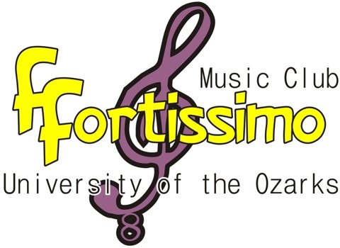
Last night, my wife kept me up late (she didn't mean to...she just has no real concept of time once it gets to when I need to go to bed in order to wake up ready for work...I am old, you know?) doing some logo work for her music club at the U of O. Actually, it wasn't the logos (well, one was done after my "bed time") so much as it was the rest of the stuff that she asked me to do that took me longer than I expected when I said ok. Anyway, since there's only 1 club and 4 logos, they're going to vote on them today and I thought it'd be interesting to see how their choice was compared to readers of Dim Bulb Comics. So, here they are...just vote in a reply.
a)
b)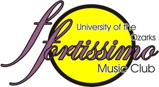
c)
d)
a)

b)
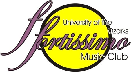
c)
d)

Labels: Stuff
posted by Noise Monkey at 8:19 AM
![]()

3 Comments:
I like the design of (c), though I don't think the font you used for the name fits very well. Using the font from (d) and the background image from (c) would be what I'd like best, I think...though that really just causes you additional problems, doesn't it?
I prefer (d), though I have to ask why three of the four have a yellow circle thing in them. Does it fit with the school logo or something?
It was along the lines of what a couple of the club's officers had described (including my wife). There might've been more variety, but I did them all in the space of about 2 hours.
Post a Comment
<< Home